Google did a good job providing a range of default watch faces on the Pixel Watch. Having lived with the first-generation wearable for an extended period, we have some design thoughts and improvements in mind.
Non-skeuomorphic hands
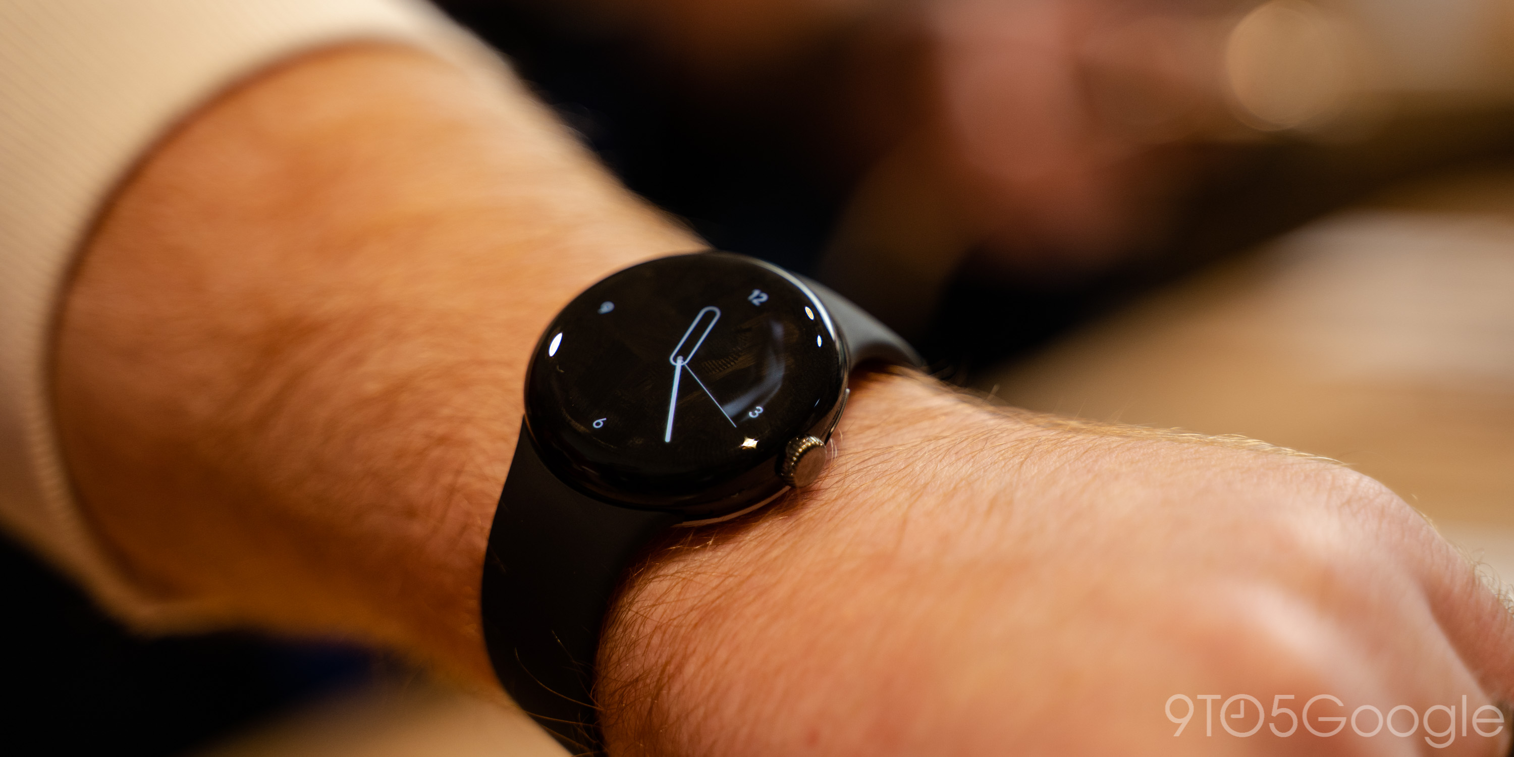
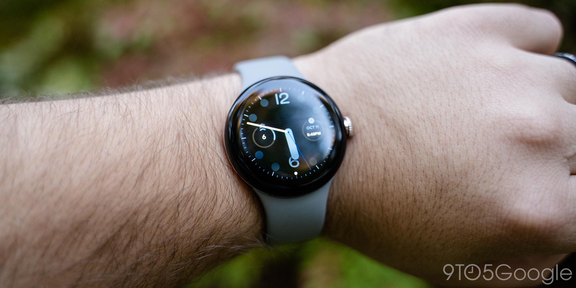
There are 10 analog watch faces with four of them doing something rather clever with the design of the hands. Classic, Dial, Ink, and Pilot feature pill-shaped hour hands that are hollow in the middle. As such, you can easily view the complications in the background. Similarly, Dial’s minute hand does not extend all the way from the center to edge so there’s not too much of an obstruction.
These design choices greatly aid legibility and reflect Google understanding that its faces do not have to mirror mechanical designs perfectly. Similar to how most watch faces let you disable the seconds hands, a nice tweak would be letting you enable the hollow hour design on Analog, Pacific, Pilot Bold, and Shapes.
Digital start
Concentric, unsurprisingly, has the most unique digital watch face design of the nine available today. The Dial I and II layouts help showcase the round nature of the Pixel Watch, but Half Dial is what makes Concentric unique.
Most of the other digital watch faces are staid in that they sometimes just feel like numbers, text, and shapes on a black background. There’s absolutely nothing wrong with that and I use Utility daily, but it pales in comparison to Concentric where the time is displayed in a unique manner that’s an homage to analog/circles, but is something that would mostly not be possible mechanically. The complication placement to the side is nice and Google should update Radial so its analog clock also supports digital time.
One thing that Google masterfully avoided is what I call the crowded G-Shock look that some digital faces rush to adopt. They pack so much information that legibility greatly suffers. It’s good that the Pixel Watch left that choice to the realm of third-party faces.
Google should take inspiration from its past to make more unique, Concentric-esque watch faces. ustwo’s Portions watch face from the Android Wear 2.0 launch should be modernized as that was a good and unique digital approach.
Complications
Complication slots are the reason Utility is my daily driver with four being the minimum for me. Index leans too much into the “text on a background” effect for me. However, the most widely used complication style is the circle with the rectangular slot style only properly leveraged by Media controls and Next event.
As third-party Wear OS 3 support grows, Google should guide developers into better supporting the rectangle complication, while also adding it to more faces.
Abstract
- Analog
- Styles: None or Numerals
- Seconds: On or off
- Complication: 1 circular
- Unique design element(s):
- Hands: Thick, elongated pill for hours and a miniature floating pill for minutes. Seconds, if enabled, is a circle.
This watch face is interesting for the floating minute “hand” that does not obstruct the background/complication.
Analog
- Analog
- Styles: None, Numerals I (dashes), Numerals II (1-12), Dashes, or Dots I (at 12/3/6/9)
- Seconds: On or off
- Complications: 1 circular
Simplest face found on the Pixel Watch.
Big Time
- Digital
- Complications: None
A two-line clock like the Android 12+ lockscreen that’s a bit too thin.
Classic
- Analog
- Styles: Arabic I (dashes), Arabic II (dots), Roman I (dashes), Roman II (dots), Dashes, or Dots
- Seconds: On or off
- Complications: 4 circular
Outline-style hour pill that does not obstruct complications.
Concentric
- Digital
- Layout (complications):
- Dial I: Dashes
- Dial II: Just numerals
- Half Dial: Dial I with 3 circular complications
Dial
- Analog
- Styles: None, Numerals I (every 5 mins), Numerals II (00/10/20/30/40/50), Numerals III (1-12)
- Seconds: On or off
- Complications: 4 circular
- Unique design element(s):
- Hands: Thick pill for hour and a miniature floating one for minutes. Seconds, if enabled, is a circle.
Outline-style hour pill that does not obstruct complications.
Everyday
- Digital
- Bold Time: On or off
- Layout (complications)
- Info: 2 circular complications + line-style complication
- Big: Double-line clock. Less wide than Big Time
Nice balance of complications with time that is easy to read. Be sure to use the Bold option, while the Big layout is a better choice than Big Time for those that want the simplest possible face.
Index
- Digital
- Bold Time: On or off
- Seconds: On or off
- Complications: 5 line-style
Most info-dense option with a two-line clock that isn’t packed, but feels too minimally designed.
Ink
- Analog
- Styles: Cardinal I (Just 12/3/6/9), Cardinal II (Dots for 12/3/6/9), Cardinal III (Dashes for 12/3/6/9), Hours I (Just 1-12), Hours II (Dashes 1-12)
- Seconds: On or off
- Complications: 4 circular
The rare Pixel Watch face with a background that isn’t pure black.
Pacific
- Analog
- Layout: Markers (Chevrons, circles, and pills), Date (Markers with date at 3 o’clock), Numerals I (Makers with 12/6), Numerals II (Chevrons and pills with 1/2/4/5/7/8/10/11), Info (Circles and 12/6 with two circular complications)
- Seconds: On or off
- Complications: 2 circular with Info
Dive-inspired watch face. As a reminder, the Pixel Watch is rated 5 ATM.
Photos
- Digital
- Layout: Linear (1-line clock) or Stacked (2-line)
- Complication: 1 line-style
A necessary inclusion that supports up to 30 photos.
Pilot
- Analog
- Styles: Dots or Dashes
- Layout: Date (at 3 o’clock), Numerals (1-12), Info (Numerals with two circular complications), Info II (Numerals with four circular complications)
- Complications: 2 or 4 circular
- Seconds: On or off
Inspired by pilot watches with a focus on legibility.
Pilot Bold
- Analog
- Styles: Dashes or None
- Layout: Date (at 3 o’clock), Numerals (12/3/6/9), Info I (Numerals with one circular complication), Info II (Numerals with two circular complications)
- Complications: 1 or 2 circular
- Seconds: On or off
Prime
- Digital
- Complication: 1 line-style
The font is Google Sans for those that like reading the time. One more line-style complication slot would be nice.
Radial
- Styles: None, Numerals (1-12), Dashes I (12), Dashes II (60)
- Seconds: One or off
- Complications: 3 circular
Many similarities with Concentric. Google should add a digital clock option.
Shapes
- Analog
- Layout: Hours or Cardinal
- Complications: 1 circular
Somewhat annoying that the sides of each shape don’t correspond to the hour. Clearly trying to be the “Google” watch face, but the more Google-y thing would be a different way of conveying the time.
Track
- Digital
- Bold time: On or off
- Layout: Stacked or Linear
- Complication: 1 line-style
Fitbit-esque watch face best used with a health stat.
Utility
- Digital
- Bold time: On or off
- Layout: Modular I, Modular II, Modular III, or Minimal
- Complications: Up to 4
Best option for easy-to-ready time and large complications. Modular II and II have a unique rectangular-style complication slot that’s fortunately not very well leveraged by Wear OS. Meanwhile, minimal is for those that want a large one-line clock.
Vista
- Digital
- Scene: Ocean, Meadow, Desert
Vaguely reminiscent of Live Wallpapers on Pixel phones and ripe for seasonal additions.
FTC: We use income earning auto affiliate links. More.


